From Raw Data to Insight: The Power of Custom Dashboards
Many leaders face a frustrating paradox: they are overwhelmed with information but starved for true insight. This is where the transformative power of a custom dashboard, built with modern BI (Business Intelligence) tools, becomes essential. It’s the bridge that turns messy, disconnected spreadsheets and raw data streams into a clear, actionable, and strategic asset for your entire organization.
For fast-growing companies navigating the opportunities of Vision 2030, the ability to make quick, data-driven decisions is a critical competitive advantage. A generic, one-size-fits-all report can’t provide the tailored clarity needed. A custom dashboard, however, is designed specifically to answer your most important business questions, providing the business intelligence insight you need to drive growth and efficiency.

What Is a Custom Dashboard in BI?
A custom dashboard is a data visualization interface that is uniquely designed and configured to meet the specific needs, goals, and KPIs of an organization. As digital consultants often emphasize, the true power of customizable dashboards lies in their ability to filter out noise and focus on what truly matters to your business. Unlike generic templates or the built-in analytics of a single software platform, a custom dashboard is built from the ground up, giving you complete control.
The “custom” aspect is what makes it so powerful. This flexibility allows you to:
- Choose Your Metrics: Display only the KPIs that truly matter to your business objectives, eliminating noise and focusing on what drives performance.
- Integrate Multiple Data Sources: Pull data from your CRM, ERP, marketing platforms, financial software, and even external market data into one unified view.
- Tailor the Layout and Visuals: Design the dashboard in a way that tells a logical story, with a layout and visuals that are intuitive for your team.
- Support Bilingual Needs: For businesses in the Kingdom, a custom dashboard can be designed for seamless use in both Arabic and English, ensuring company-wide adoption.
Why Raw Data Alone Isn’t Enough
Many organizations still rely on raw data exported into spreadsheets. While this data is valuable, it has significant limitations. It’s static, quickly becomes outdated, and requires hours of manual work to analyze. Furthermore, rows and columns of numbers don’t easily reveal trends, patterns, or correlations.
The human brain processes visual information 60,000 times faster than text. This is why data visualization is so critical. A well-designed chart can instantly show a trend that would take hours to spot in a spreadsheet. To turn data into insight, you must first make it understandable.
Step-by-Step: Turning Raw Data into Insight
Learning how to build custom dashboards is a structured process. It’s about translating a business need into a clear, visual, and interactive tool.
Step 1: Define Your Business Goal
This is the most crucial step. Before you think about charts or data, define the primary business question you need to answer. Is it to improve sales team performance? Optimize operational costs? Enhance the customer experience? A clear objective will guide the entire design process.
Step 2: Identify Relevant Data Sources
Based on your goal, identify where the necessary data resides. If your goal is to improve customer retention, your data sources might include your CRM (for customer history), your support desk software (for ticket data), and your survey platform (for NPS/CSAT scores).
Step 3: Clean and Prepare Your Data
Raw data is often “dirty”—it can have duplicates, errors, or inconsistencies. This step involves using tools within your BI platform (like Power Query in Power BI) to clean, transform, and structure the data so it’s accurate and reliable. This ensures the insights you derive are trustworthy.
Step 4: Choose the Right BI Tool
Select a business intelligence tool that fits your needs and technical capabilities. Popular choices include:
- Microsoft Power BI: Excellent for its deep integration with the Microsoft ecosystem, powerful data modeling, and user-friendly interface.
- Tableau: Known for its beautiful and highly flexible data visualizations.
- Google Data Studio: A great free option for visualizing data from Google’s ecosystem (e.g., Google Analytics, Google Ads).
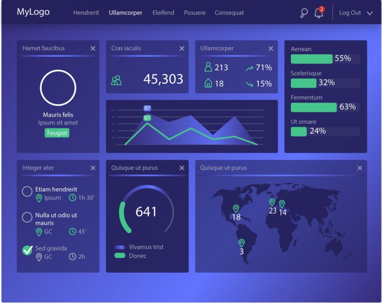
Step 5: Design Your Dashboard with Clarity and Purpose
This is where you apply your custom dashboard design tips to bring your data to life. Once you have selected a tool like Power BI, you can follow the official Microsoft documentation on how to build custom reports and visuals. The key is to not just pick visuals at random, but to choose them based on what you want to communicate:
- Start with a high-level summary: Place your most important KPIs at the top for an at-a-glance view.
- Use visuals that fit the data: Use line charts for trends over time, bar charts for comparisons, and maps for geographical data.
- Keep it simple: Avoid clutter. Use whitespace effectively and don’t try to cram too much information onto one screen.
- Tell a story: Arrange your visuals in a logical flow that guides the user from a high-level overview to more detailed insights.
Step 6: Share Insights and Build a Data-Driven Culture
A dashboard’s value is only realized when it’s used. Share the dashboard with relevant team members, train them on how to use it, and incorporate it into your regular meetings and decision-making processes.
Real-World Use Case
A Riyadh-based luxury retail group was struggling to understand store performance across its different locations. They relied on separate, delayed reports from each branch manager, making cross-location comparisons difficult and slow.
They worked with a partner to build a custom dashboard that integrated their point-of-sale (POS), inventory, and foot traffic sensor data. The result was transformative. The dashboard visualized real-time sales per square foot, top-selling items by location, and peak customer traffic hours. Leadership could instantly see that while the Jeddah branch had higher overall sales, the Dammam branch had a higher conversion rate during evening hours. This insight led them to reallocate staffing in the Jeddah branch for evening shifts, boosting sales by 12% in the following quarter.
This principle also applies to internal operations. For managers, a well-designed dashboard can provide high-level visibility into team performance and project progress without resorting to constant check-ins. As some leaders have shared, a custom dashboard can be a powerful tool for tracking team performance without micromanaging, fostering a culture of trust and accountability.
Common Mistakes to Avoid
- Dashboard Overload: Including too many charts and KPIs on one screen creates “analysis paralysis.” Focus on what’s essential.
- Stale Data: A dashboard is only useful if the data is fresh. Ensure your data sources are set to refresh regularly (daily or even hourly, depending on the need).
- Designing in a Vacuum: The dashboard must be designed for its end-users. Involve them in the design process to ensure it meets their needs and is easy for them to understand and use.
By implementing a custom BI dashboard integrated with their point-of-sale and inventory systems, her leadership team gained a new level of insight.
- Before: It would take days to identify why one region was underperforming.
- After: The dashboard immediately visualized that stores in the Eastern Province had low stock of a best-selling item. The CEO could see the sales dip, drill down to the inventory data, and instruct the logistics team to reroute stock, all within a single morning meeting. This use of data visualization for faster insights cut their decision-making and response time by over 50%.
From identifying your most promising customer segments to validating your product’s appeal with a local audience, we help you build a data-driven market expansion strategy with confidence.
Why IBS Is the Right Partner
At IBS Customer Experience, we understand that building an effective custom dashboard is about more than just technology; it’s about understanding your business. Our expertise lies in working with dashboard tools for Saudi businesses to create solutions that are not only powerful but also practical.
We specialize in:
- KPI Consultation: Helping you define the metrics that truly matter.
- Bilingual Setup: Designing fully functional dashboards in both Arabic and English.
- Data Integration: Connecting all your disparate data sources into one unified view.
- Implementation and Training: Ensuring your team can confidently use the tools we build.
Conclusion
In an increasingly data-rich world, the ability to turn data into insight is what separates market leaders from the rest. A custom BI dashboard is the engine that drives this transformation, providing the clarity, speed, and confidence needed to make smarter strategic decisions. It moves your organization from reacting to the past to proactively shaping the future.
Keep Reading
Related Article
Measure Marketing ROI: How to Analyze Your Campaigns and Maximize Ad Performance
Measure Marketing ROI: How to Analyze Your Campaigns and Maximize Ad Performance In today’s competitive business landscape, every riyal spent on marketing must be accountable.

The 5 Best CRM Systems in 2025: A Comprehensive Comparison of Salesforce, Zoho, HubSpot, Dynamics, and Odoo
The 5 Best CRM Systems in 2025: A Comprehensive Comparison of Salesforce, Zoho, HubSpot, Dynamics, and Odoo In today’s business world, using a Customer Relationship